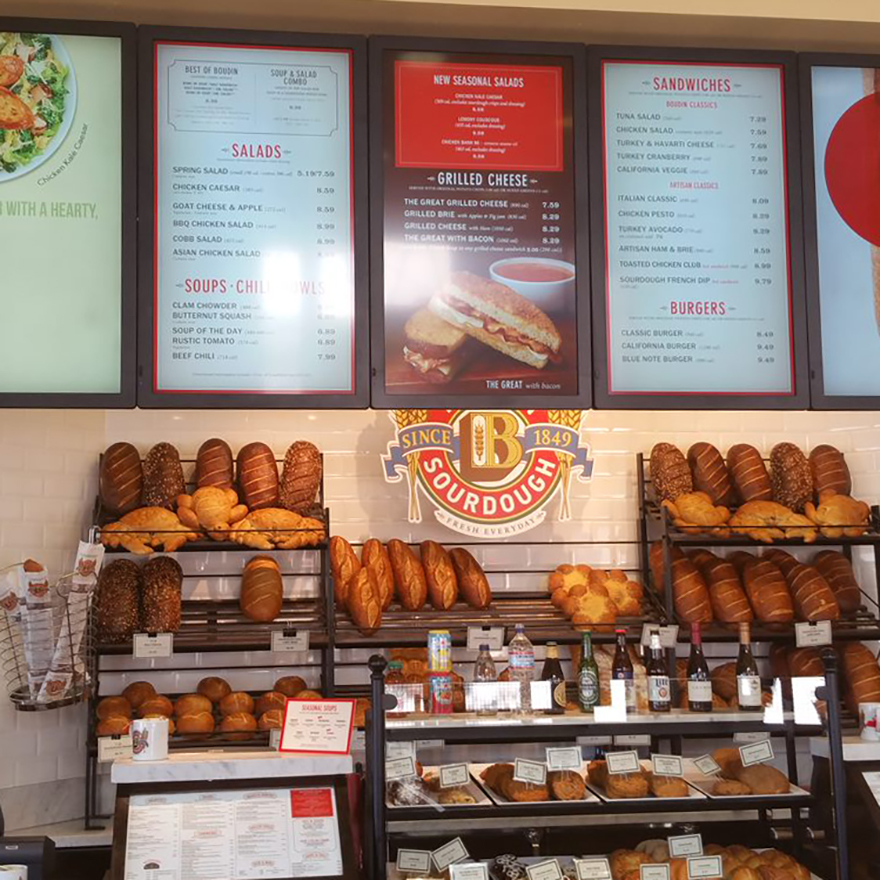
Digital Menu Best Practices

Your menu communicates more than just item names and prices to your customer. To reap all the benefits of digital menu boards, careful consideration and planning must go into their design and utilization. Consider our favorite menu best practices as point of reference when building your own digital board strategies.
Moving from static to digital is a whole new ball game. With a digital medium, the possibilities for how you communicate your message are nearly limitless for your restaurant and goals.
Digital Menus Shouldn’t Be Replicas of Static Ones
As always, your menu design must be well thought out and strategic to align with your business goals. Layout, colors, fonts, animations, and video all play an important role.
This best practices guide will equip you with a list of items your restaurant should consider when striving to capitalize on digital menu benefits. When used properly, digital menu boards make things easier for management, your customer, and creative teams.
Menu Photography & Videography
Great photography and videography are key when designing your digital menu boards, which are an extension of your advertising. The close-up shot of a burger dripping with cheese makes people crave it and more apt to buy; make sure to showcase effectively.
Here are some tips for using photography and videography on your digital menu boards:
1. Use what you have first.
Build a library of all images and videos to pull from. While there is no rule on how many photos can be showcased on your menu board, good photography is a critical factor in determining how well something might sell. If you find yourself lacking high-quality imagery, the internet offers a plethora of free images for use.
2. Enhance still photography with animation.
Adding subtle animations, such as steam rising off a cup of coffee or panning left to right over your signature dish, enliven your photography and draw attention to your boards with movement.
3. Animate your menus with video when you can.
Nothing is more captivating than video. It draws attention and creates a memorable experience while influencing buyer behavior. Did you know that content in motion is 10x more eye-catching than static content?
Color & Layout Best Practices
Your digital menu boards are an extension of your overall brand. The use of color and layout on your digital menu boards is vital to maintaining your brand’s look and feel while making your boards legible. Make sure you are using the same colors as your brand to ensure consistency.
Things you want to consider:
1. Keep readability in mind.
Your boards should be easy to read from 10-15 feet away. Choosing colors that contrast well help with readability.
2. Compete or compliment.
There are two common approaches to adding animation to digital menu boards:
- Complementing the menu or competing with the menu for attention. Animation that draws the viewers’ attention away from the standard menu and towards a high-margin or limited-time offer would compete for the viewers’ focus.
- Photography that pans and includes a subtle menu item caption animation would complement the standard menu. The strategy you select should reflect your overall goals.
3. Consistency is key to experience.
Your photography should have a consistent look throughout your menu boards. If your budget allows, have your photographer take multiple shots of each item from different angles. If your budget is smaller, consider using placeholder photography while designing your layout; that way, you can tell the photographer exactly which angles you would like your photos taken from.
Font Size & Style
Your menu boards should be easy to read and understand from a distance. Using a font size of 30pt or larger is recommended, but the smaller type can be used if you choose to have larger screens or have a shorter average distance from your screens.
Tips for choosing a typeface:
1. Typefaces matter.
Choose a typeface that is easy to read and fits your brand. Serif typefaces are commonly used for headers, larger text items, and menu item names. Sans serif typefaces work best for description text and pricing.
2. Contrast your menu colors.
Dark text on a light background is best for menus with lots of content to read. Most consumers experience less eye strain with this combination, which makes it easier to read all the information. Light text on a dark background is best for scanning menus. This works well for highlighting menu items, as it calls out info the user can scan over, navigating them toward a desired menu section/item with ease.
3. Readibility can make or break sales.
Test your content. Menus can read differently from computer screen to digital menu board. While your menu may look great and be easy to read on your computer screen, it may not be once it’s on a digital menu board, read from 15 feet away. Make sure to test your content in-house before go-live to ensure all content is easily read.
Keep the Customer in Mind
Your digital menu boards can have an amazing impact.
Keep your goals and motivators for moving to digital at the forefront of your menu design. Are you looking to influence buyer behavior? Are you looking to decrease the amount of time customers spend in line?
Utilizing board space for promotions can help the consumer arrive at a decision quickly and give them the perception of a shorter wait time. Using animations will draw a customer’s attention to those items.
Moving to digital allows for the opportunity to re-evaluate the message your menu boards are delivering, and increase flexibility for all your locations.
1. Showcase dayparts.
Utilizing dayparts is one of the easiest ways to add new life to your digital menu boards. Adjusting your menu based on the time of day can offer significant value to your business, allowing you to highlight different items throughout the day. Common dayparts are breakfast, lunch, and dinner, while some companies also utilize happy hour and late night dayparts.
Restaurants with digital menu boards can quickly and easily move from one mealtime to the next, incorporating new products or promotions during a mid-day or dinner rush.
Motivation for utilizing dayparts vary between brands, but common reasons include:
2. Don’t forget transitions.
Promotions to help transition from one mealtime to another
3. Leverage the time between meals.
Incorporating snack options for customers between meals
4. Promotions work.
Promoting easily made or high-margin products during busy time periods. Promoting surplus or soon-to-expire items on a restaurant-to-restaurant basis.
Plan Ahead
One of the biggest advantages of digital menu boards is the ease in which you can roll out new menu offerings and/or limited-time offers. It’s crucial to plan for any possible menu changes when setting up your digital menu boards for maximum flexibility. Consider frequency of menu item changes, LTOs, daily and weekly specials, etc., when designing your boards.
Setting up LTOs and promotions in advance allows for the best use of them in your marketing strategy.
Creating a library of the promotional material allows sites to easily customize their boards to influence buyer behavior based on business needs.
Utilizing dynamic text allows for customization on prices or certain menu items at a single site, region or company-wide.
Testing & Flexibility
1. Comparing apples to apples and oranges to oranges.
Keep notes about your digital menu board goals and how your boards perform (e.g. overall food sales, key menu item sales, average ticket size increase). Designating certain areas of your menus for product testing can help test new products prior to site-wide rollout or permanent menu addition.
Use A/B testing to test different layouts, promotions, menu mixes, etc. Running a test for 30-60 days allows you to see the full impact. Once your tests are complete, use the collected data to make necessary changes that maximize positive outcomes in your restaurants. Using data to guide your strategy is the key to achieving the results you seek.
Partner with WAND for Guaranteed Menu Design Best Practices
We are an agency inside of a business. Our diverse team is comprised of creative project managers, designers, animators, and deployment specialists. Each member of our team provides specific areas of expertise throughout our creative process. We create custom, award-winning digital menus, and promotional advertising. It is what we do. It is all we do.
Chat with us today and see what’s possible.
Related Reading

Do More with Digital Displays
Scale your business, grow your brand, and delight more customers with the magic of digital menus and signs.


