The Ultimate Guide to Designing the Best Digital Restaurant Menu

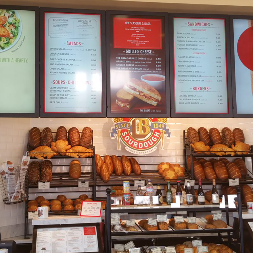
If your kitchen creates mouthwatering dishes but no one ever orders them, does your restaurant even stand a chance? In short, not so much. Static images, nondescript menu items, hidden promotions—all of these impact what and how people order. Digital restaurant menus, on the other hand, showcase your cuisine in the best light while giving customers the details they need.
Menus are an introduction, a guide, a selling tool, and a promise. How you design and construct your digital menu matters. Put your best format forward using these expert tips.
Organize Your Digital Restaurant Menu Strategically
Diners read menus the same way they read books: left to right, top to bottom. Design your menu accordingly — with crucial information in the upper left-hand corner and loss leaders toward the bottom right. It’s also not a bad idea to glean information from other restaurant menus. For example, if the majority of restaurants stick their side dishes in the bottom right-hand corner, it makes sense to place your sides there, too, and dodge confusion or frustration.
Also remember that solid blocks of text are difficult to read. Instead, use categories, columns, and rows to give your menu structure and flow. Boxes are ideal for highlighting high-margin items or signature dishes, while lines come in handy when you want to make a clear demarcation between course offerings or emphasize a header.
Divide the Menu Logically
People like to order the same way they eat — appetizers first, salads and soups second, entrees third, etc. Lay out your menu similarly so guests can find what they want without getting frustrated. The more you can reduce friction while ordering, the better. Not only will a thoughtfully planned menu mean quicker service for all you customers, but it’ll eliminate any stress that could otherwise crop up. After all, you don’t want to be remembered as the restaurant that stressed someone out so much that they’ll never come back.
Use High-quality Images (Sparingly)
Photographs are optional, but if you’re going to include pictures on your menu, they must be used strategically. Unless you’re opening an eatery serving exotic dishes few locals would easily recognize, providing a photo for every item is overkill. Focus on a few dishes — perhaps one in each category or dishes with presentations guests have to see to believe — and rely on your servers and menu descriptions to sell the rest.
Invest in a professional photographer, no exceptions. Forget about smartphone shots or shaky videos; bold, skillfully staged pictures work best and showcase your food in the best light (literally).
Think Critically About Menu Color
Much in the same way that the smell of cinnamon might remind you of the holidays or the taste of Champagne makes you want to celebrate, certain colors have major sensory impact:
- Red is a noted stimulant and inspires passion and energy.
- Orange can be optimistic and fun, but it also sometimes comes off as impulsive or immature. More importantly, orange makes people think of value.
- Yellow is the color of sunshine, happiness and youth; it makes some people uneasy, which makes it an ideal hue for quick-service restaurants that need to turn tables quickly.
- Blue is comparatively sedate and conservative and is felt to represent security and trust.
- Green is the color of health, money, relaxation, and nature. Green on a menu is frequently taken as an indicator of healthy or vegetarian dishes and may suggest freshness.
Those are just a few examples of how colors can shape guest perception, but there is an endless array of shades within each of those color categories. Finding the right combination is a process, but the results could help you influence consumer buying patterns and boost sales. When using digital restaurant menus, it’s also easy to test colors. Easily adjust and update your menu design, gather data, and make informed decisions based on your own in-house testing.
Turn Your Menu into a Branded Experience
Above all, your digital menu should look like it belongs to your restaurant. Match the vibe, color scheme, font, voice, and other key attributes to the rest of your establishment and your marketing materials. Cohesion is the foundation of effective branding. When each element seems like it’s part of a bigger whole, guests develop a sense of familiarity that helps them feel more comfortable. Comfortable guests are also more likely to stay longer, order more, and return frequently.
Ready to improve your digital restaurant menu?
Related Reading

Do More with Digital Displays
Scale your business, grow your brand, and delight more customers with the magic of digital menus and signs.


